Colour Palette for Home Interior: How to Choose Colours That Truly Feel Like Home
Choosing a colour palette for your home interior can feel exciting… and confusing at the same time. One moment you love bold colours, the next you’re drawn to soft neutrals. And suddenly, you’re standing in a paint store wondering where to begin.
The good news? You don’t need to be a designer to choose the right colours. You just need to understand how colours make you feel and how they work together in your space.
Let’s break it down in a simple, stress-free way.
Why the Right Colour Palette Matters
Colours do more than decorate your walls. They affect your mood, your energy, and how comfortable your home feels every day.
A well-chosen colour palette for home interior:
- Makes rooms feel balanced and connected
- Enhances natural light
- Creates a calm and welcoming atmosphere
- Helps your furniture and décor stand out naturally
When colours work together, your home feels intentional—not random.
Start With the Mood You Want
Before picking colours, ask yourself one simple question:
How do I want this space to feel?
- Calm and relaxing? Go for soft neutrals and muted tones
- Warm and cozy? Choose earthy shades and warm whites
- Fresh and modern? Light greys, off-whites, and subtle contrasts work well
- Bold and expressive? Add colour through accent walls or décor
Your home should reflect your personality, not just a trend.
Popular Colour Palettes for Home Interior
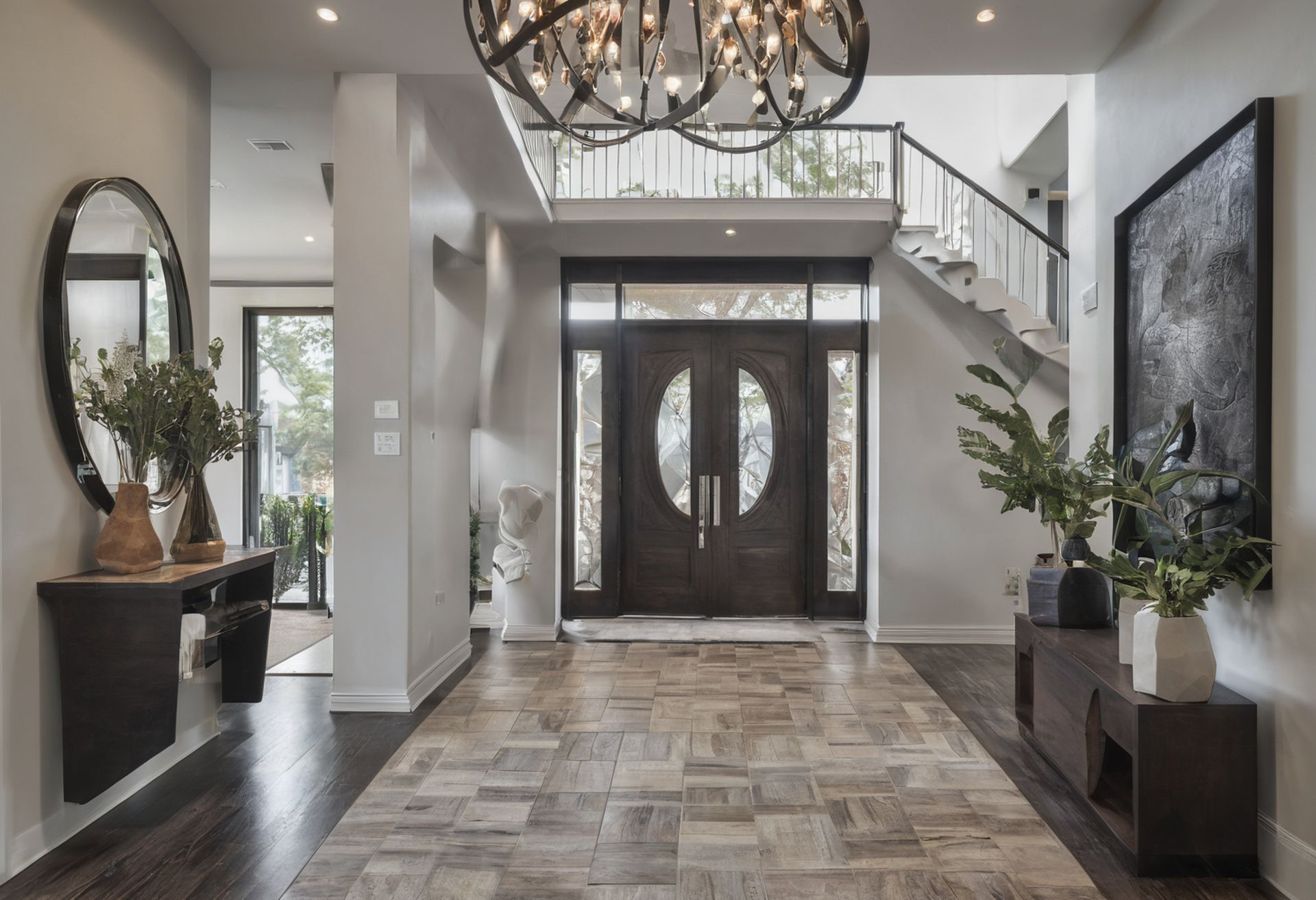
1. Neutral & Timeless
Warm White • Beige • Soft Grey • Natural Wood
This palette never goes out of style. It makes spaces feel open, bright, and easy to live in. Perfect if you like flexibility and plan to change décor often.
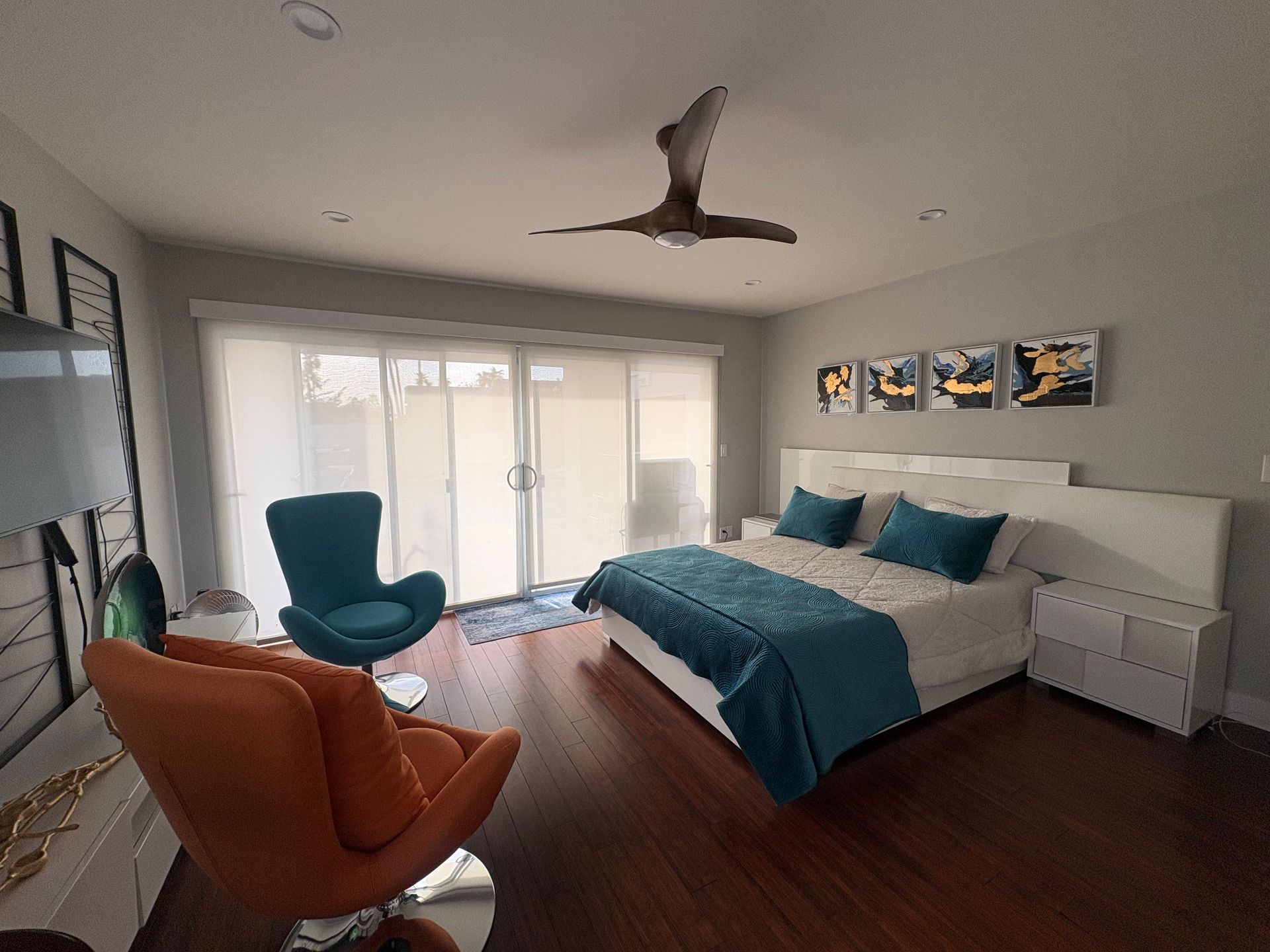
2. Soft & Peaceful
Ivory • Blush • Light Taupe • Muted Grey
A gentle palette that brings calm into your home. Ideal for bedrooms and quiet spaces where relaxation matters most.
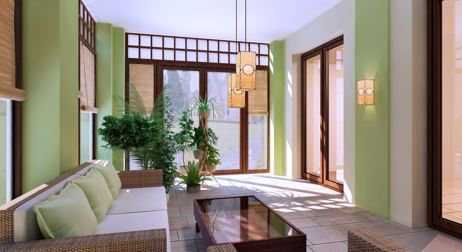
3. Earthy & Natural
Olive Green • Sand • Terracotta • Cream
Inspired by nature, this colour palette feels grounded and comforting. It works beautifully with plants, wooden furniture, and textured fabrics.
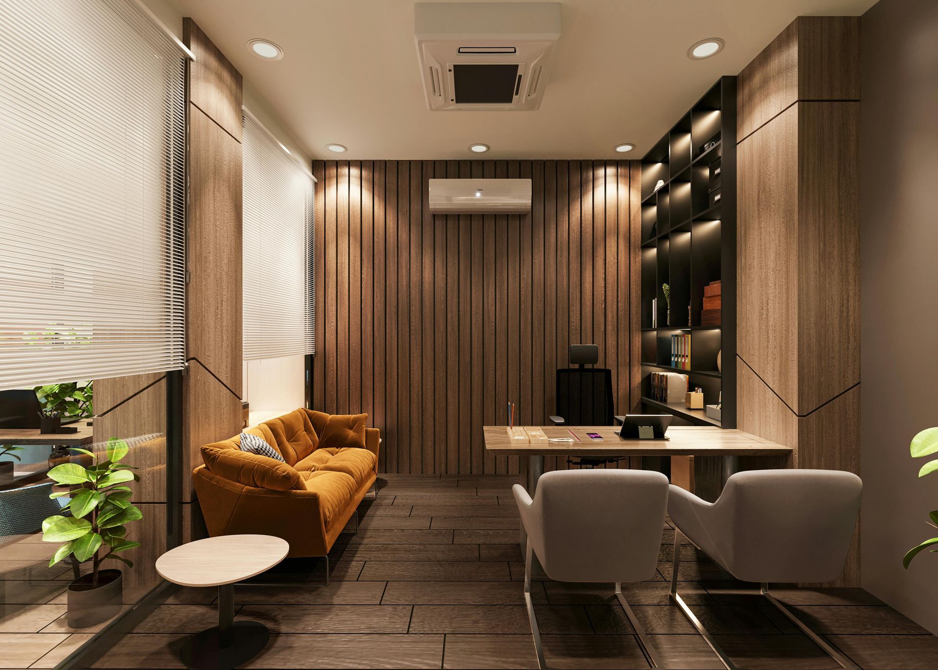
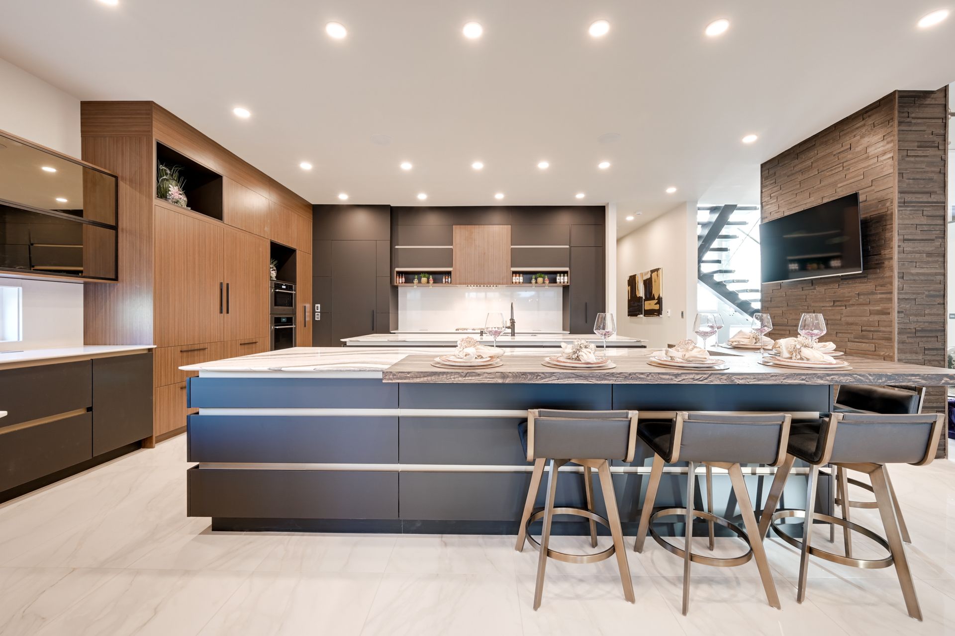
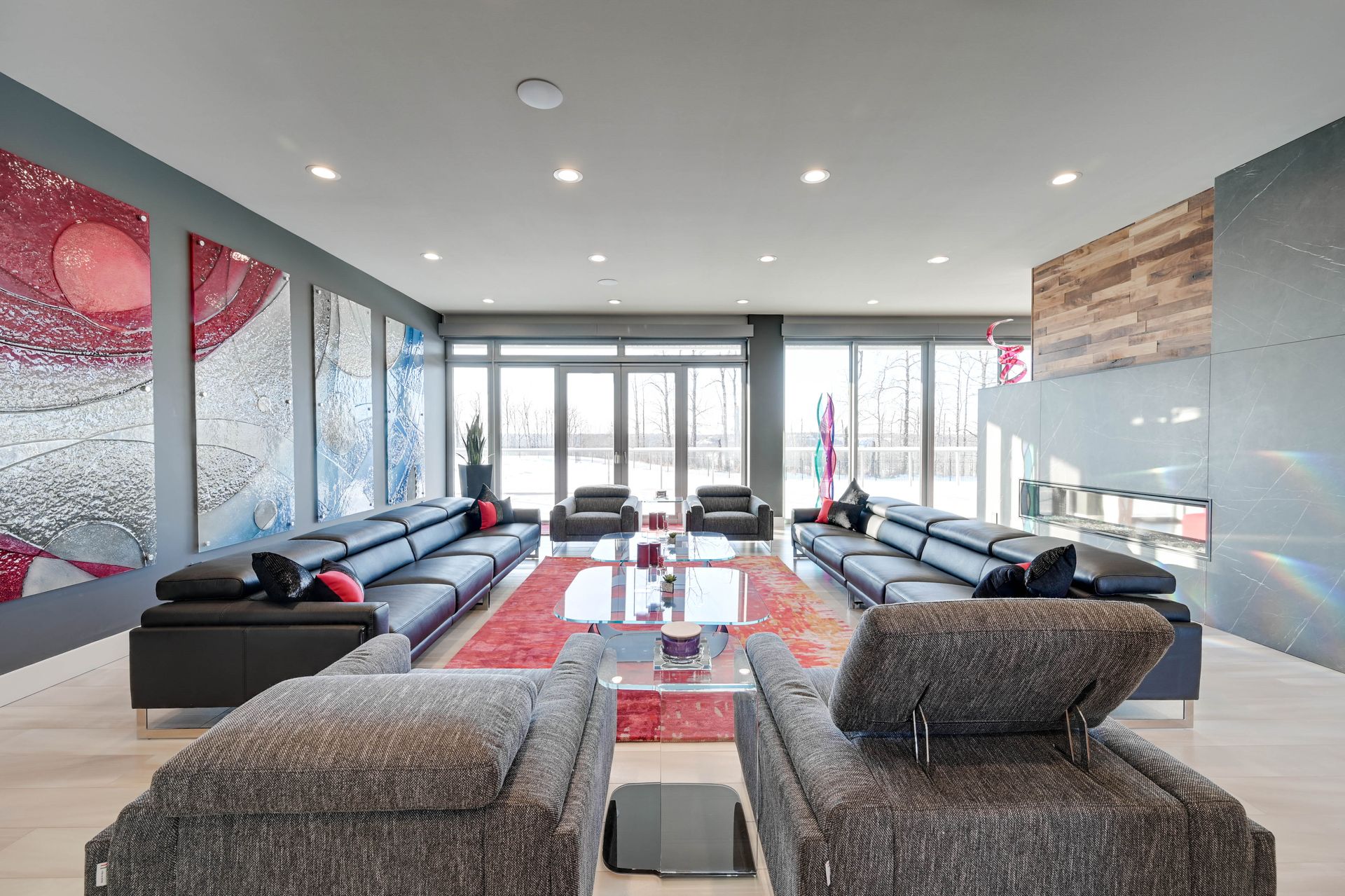
4. Modern & Clean
Off-White • Cool Grey • Charcoal • Black Accents
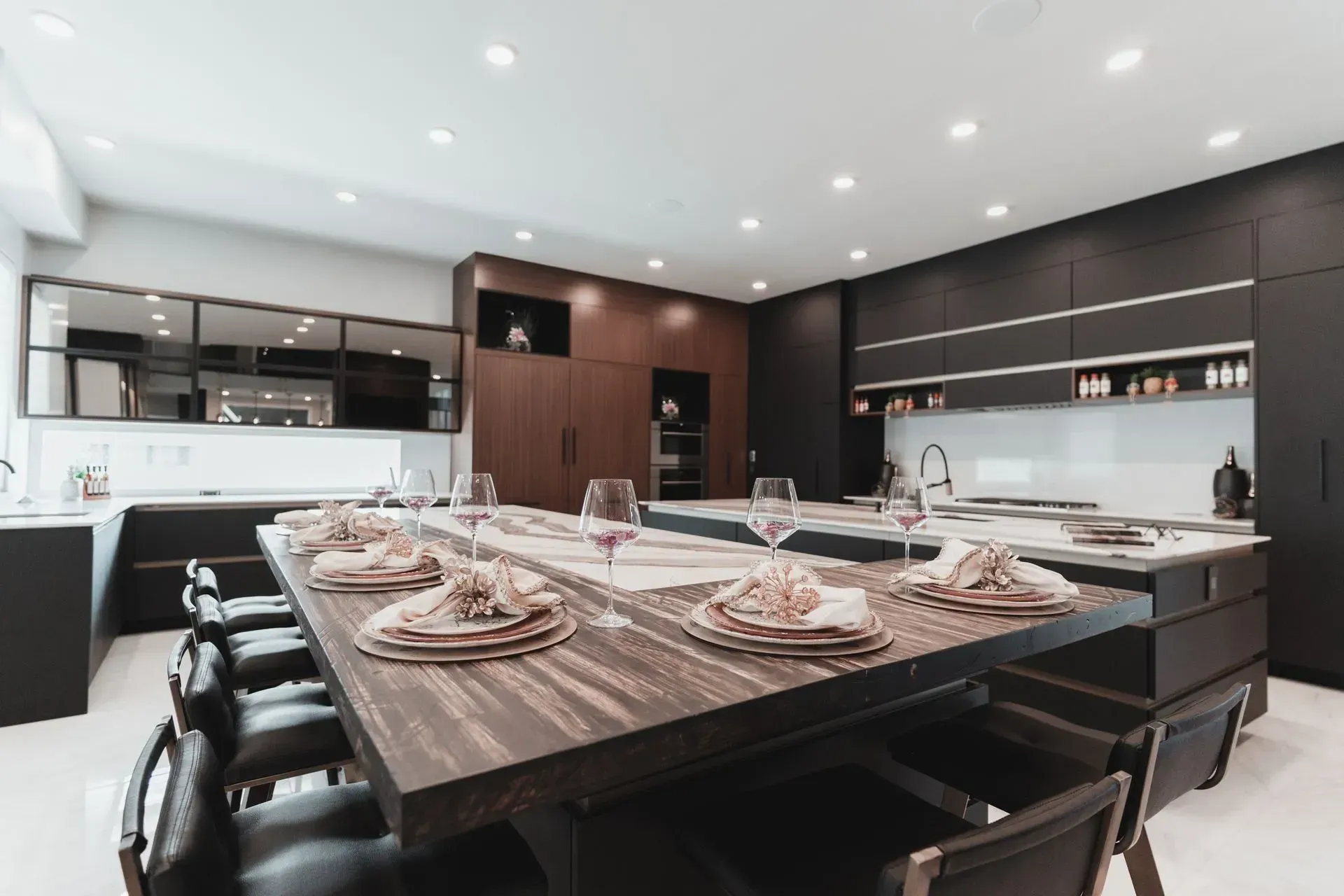
This palette suits contemporary homes and apartments. It feels sleek, organized, and polished without feeling cold.
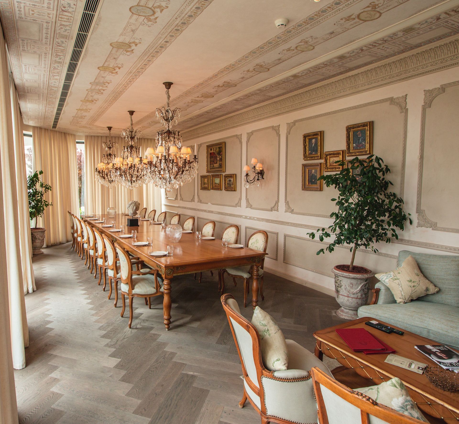
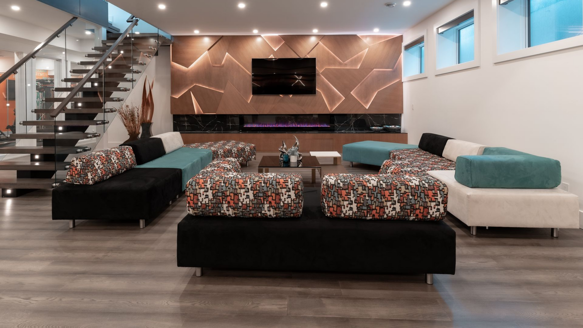
5. Elegant & Rich
Warm White • Deep Blue • Emerald Green • Gold Accents
Perfect for adding a touch of luxury. Dark colours add depth, while lighter tones keep the space balanced.
How Light Affects Colour (Don’t Skip This)
Lighting can completely change how a colour looks.
- Rooms with lots of natural light can handle darker or cooler shades
- Low-light rooms feel better with warm, lighter colours
- North-facing rooms often look cooler—warm tones help balance them
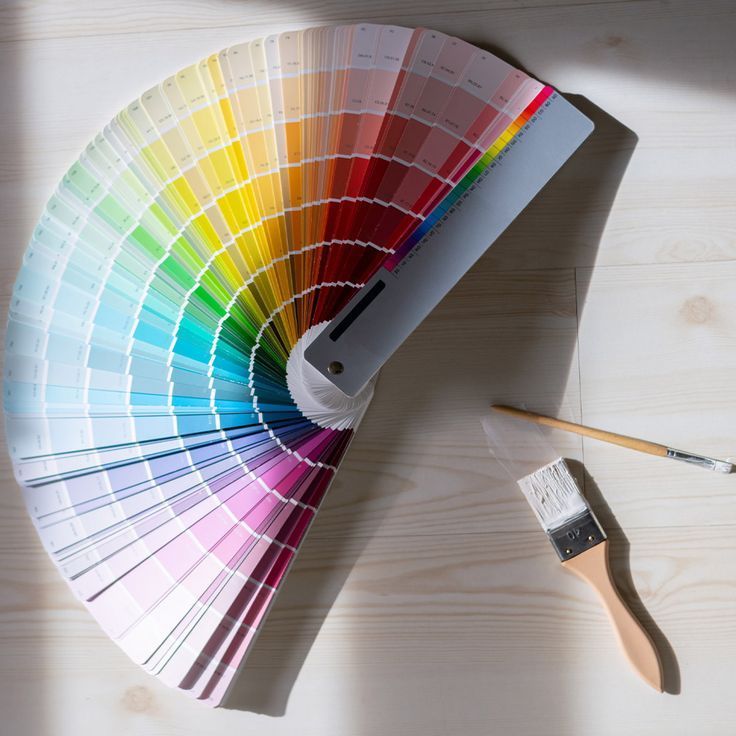
Always test paint samples on your wall and observe them throughout the day.
Keep the Whole Home Connected
Your home doesn’t need the same colour everywhere—but it should flow smoothly.
Use:
- One main neutral across most rooms
- 1–2 accent colours repeated in décor or furniture
- Slight variations to keep each room unique but connected
This creates harmony without making your home feel boring.
Final Thoughts
Choosing the right colour palette for home interior is not about rules—it’s about comfort, balance, and how you want to feel in your space.
When colours are chosen with intention, your home becomes calmer, warmer, and more welcoming. And that’s what great design is really about.
Trust your instincts, take your time, and let your home tell your story.
Share This Blog