The Psychology of Colour in Home Décor: Choosing Palettes for Mood and Harmony
Colour is a silent storyteller in your home. It whispers calm in a bedroom, shouts energy in a workout area, and fosters connection in a living room. Beyond aesthetics, colours have profound psychological effects, influencing emotions, behaviour, and even physical well-being. In this blog, Flaunt Consignment Furniture, Blinds, Interior Design & Real Estate decodes the science of colour psychology and guides you in choosing hues that align with your lifestyle and aspirations.
The Basics of Colour Psychology
Colour psychology studies how hues affect human emotions and decision-making. Warm tones (reds, oranges, yellows) tend to energize and stimulate, while cool tones (blues, greens, purples) evoke calm and introspection. Neutrals (whites, greys, beiges) provide balance and flexibility. But context matters—saturation, lighting, and personal experiences also shape how we perceive colour.
A Room-by-Room Colour Guide
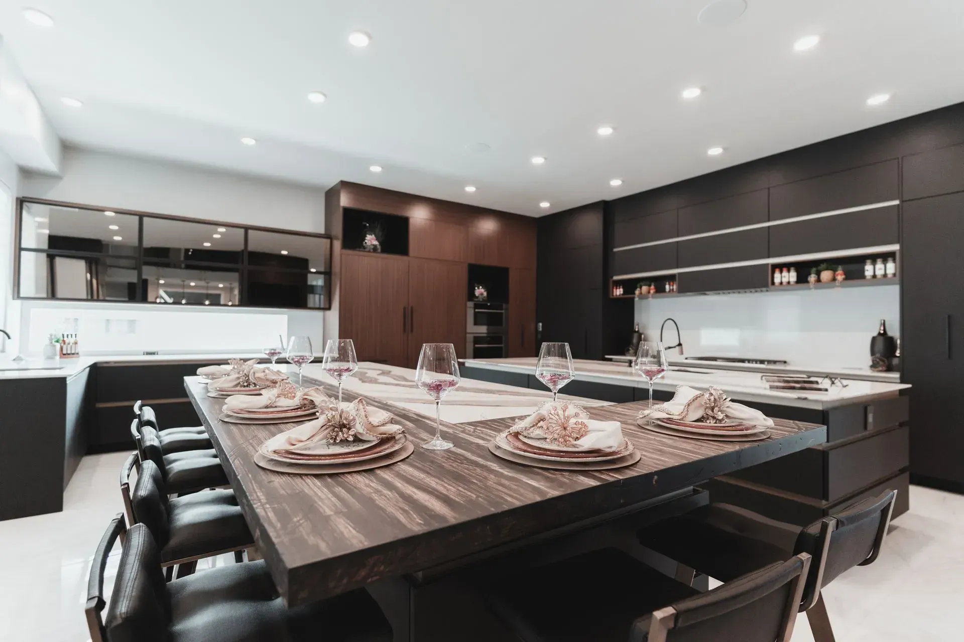
1. Red: Passion & Energy
- Psychological Impact: Red increases heart rate and appetite, making it ideal for dining rooms or kitchens. However, overuse can trigger agitation.
- Best For: Accent walls, dining spaces, or entryways to create warmth.
- Pro Tip: Pair with muted neutrals (e.g., soft grey or cream) to temper intensity.
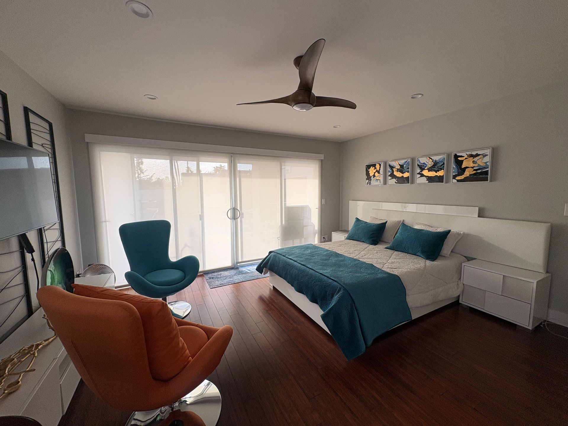
2. Blue: Calm & Focus
- Psychological Impact: Blue lowers blood pressure and promotes tranquility. Lighter shades (sky blue) feel airy; deeper tones (navy) add sophistication.
- Best For: Bedrooms, home offices, or bathrooms.
- Pro Tip: Avoid cold, sterile blues—opt for warm undertones (teal or aqua) to keep spaces inviting.
3. Yellow: Optimism & Creativity
- Psychological Impact: Yellow stimulates happiness and mental clarity but can cause eye strain in overly bright shades.
- Best For: Kitchens, playrooms, or dim hallways.
- Pro Tip: Use buttery yellows or gold accents instead of neon tones.
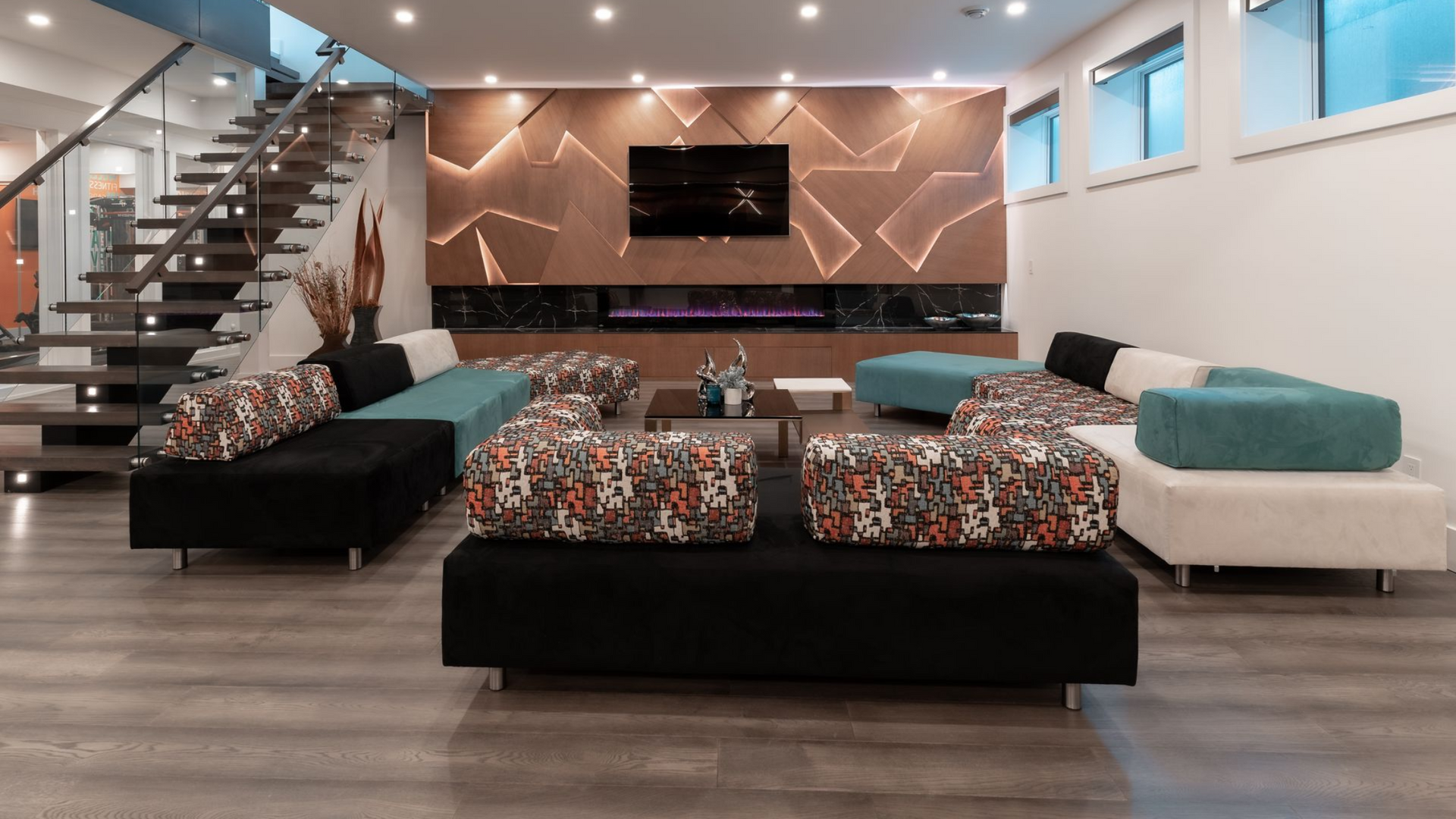
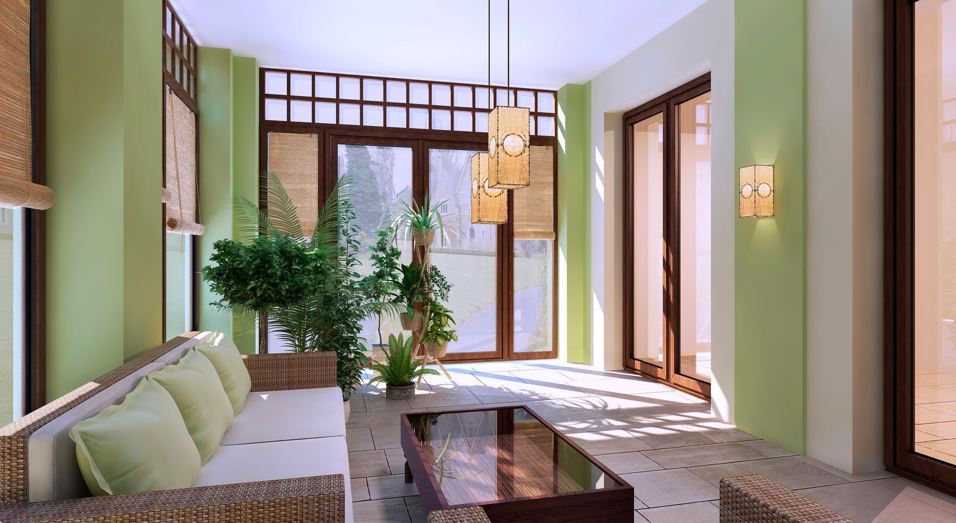
4. Green: Balance & Renewal
- Psychological Impact: Green reduces anxiety and fosters harmony, mimicking nature’s restorative effect.
- Best For: Living rooms, bedrooms, or meditation spaces.
- Pro Tip: Sage or olive greens work in modern and traditional settings.
5. Purple: Luxury & Spirituality
- Psychological Impact: Lighter lavenders soothe, while deep plums evoke opulence and creativity.
- Best For: Accent walls, reading nooks, or dressing rooms.
- Pro Tip: Pair plum with gold accents for a regal vibe.
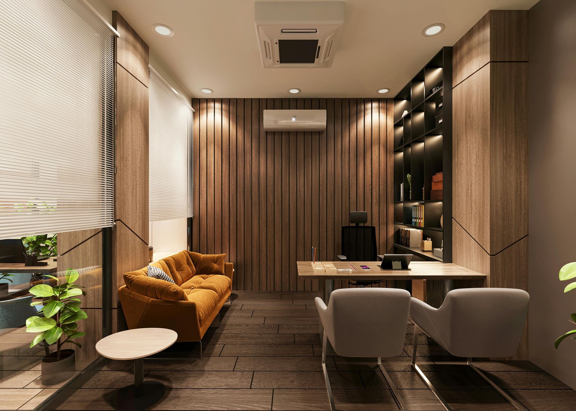
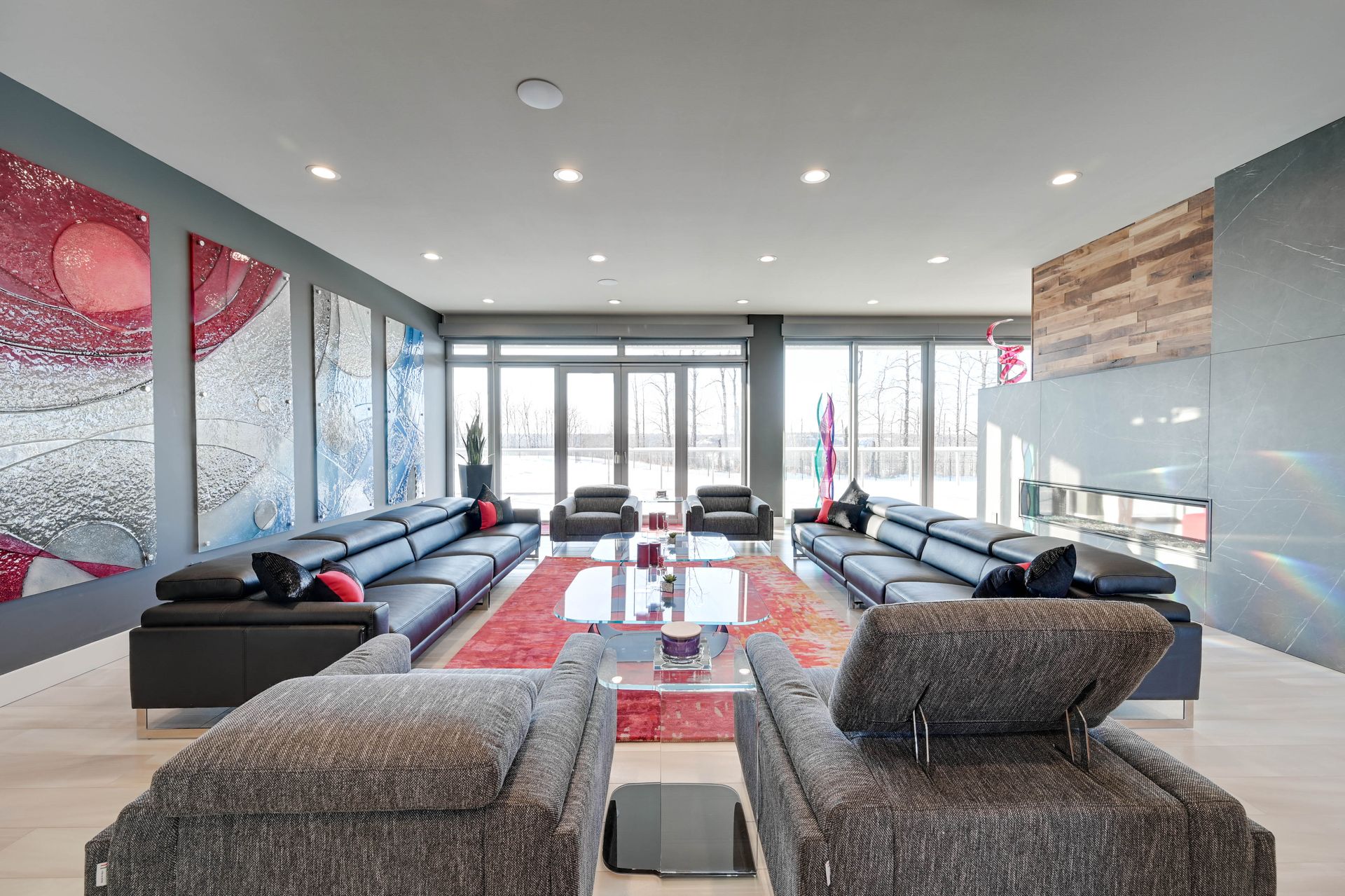
6. Orange: Warmth & Social Connection
- Psychological Impact: Orange combines red’s energy with yellow’s cheer, encouraging conversation.
- Best For: Living rooms, exercise spaces, or kitchens.
- Pro Tip: Use terracotta or burnt orange for a grounded, earthy feel.
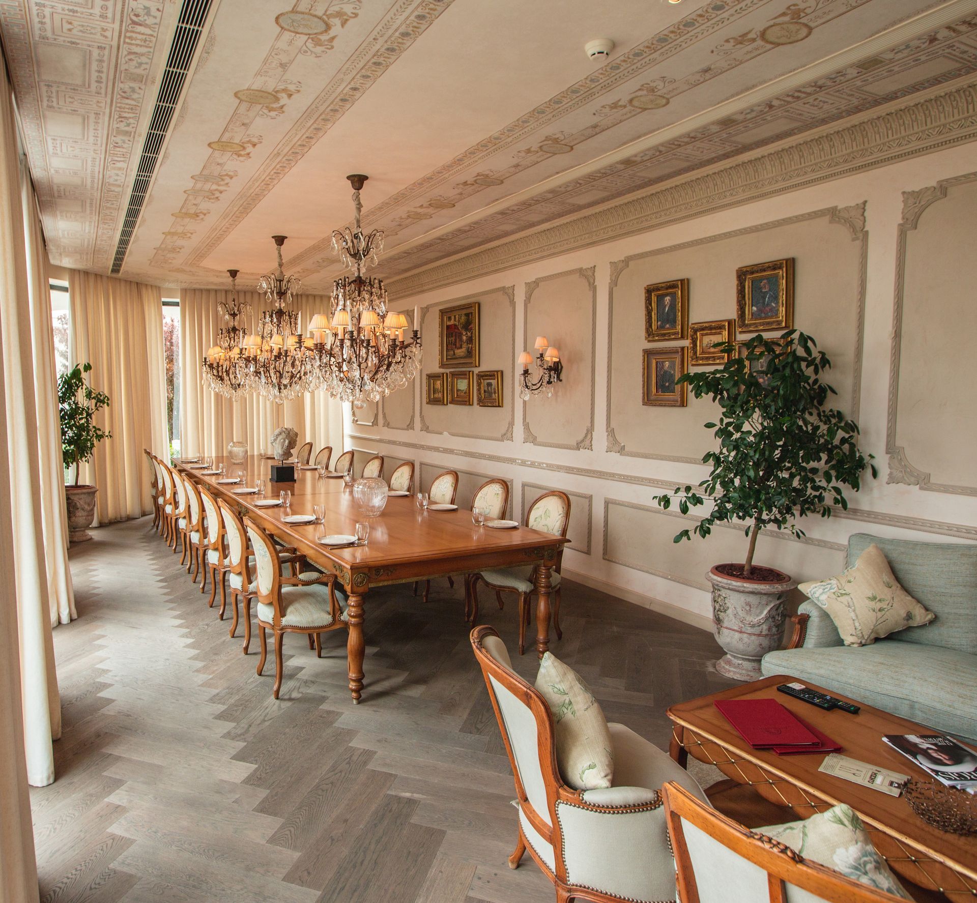
7. Neutrals: Flexibility & Timelessness
- Psychological Impact: Whites and greys create a “blank canvas” effect, reducing visual clutter. Beiges and taupes add warmth without overwhelm.
- Best For: Any room—layer with textures (wood, linen) to avoid sterility.
- Pro Tip: Warm whites (such as Swiss Coffee by Benjamin Moore) feel cozier than stark whites.
How to Choose the Right Colour
Consider Room Function:
- Bedrooms: Opt for calming blues, greens, or soft neutrals.
- Home Offices: Boost focus with muted greens or energizing yellows.
- Social Spaces: Warm reds or oranges encourage interaction.
Factor in Lighting:
- North-facing rooms lack warm light—balance with creamy yellows or peach.
- South-facing rooms get intense light—cool tones prevent overheating.
Test Before Committing:
- Paint swatches on multiple walls and observe them at different times of day.
Respect Cultural Associations:
- In Western cultures, white symbolizes purity; in some Asian cultures, it’s tied to mourning.
Colour Combinations for Harmony
- Monochromatic: Shades of one hue (for example, navy, sky blue, and powder blue) create cohesion.
- Analogous: Neighbouring colours on the wheel (such as green, blue-green, teal) offer subtle contrast.
- Complementary: Opposite colours (such as blue and orange) add dynamic energy.
Common Mistakes to Avoid
- Ignoring Undertones: A grey with pink undertones can clash with cool furniture.
- Over-Matching: Let colours complement—not mirror—each other.
- Trend Overload: Prioritize timeless hues for large surfaces; use trendy colours in easily swapped accents (pillows, art).
Final Thoughts
Colour is a powerful tool for crafting spaces that reflect and elevate your life. Whether you’re painting a nursery or revamping a home office, let psychology guide your palette. Start with one room, experiment fearlessly, and remember: your home should not only look beautiful—it should feel like you. At Flaunt Consignment Furniture, Blinds, Interior Design & Real Estate, our experts can help you turn colour inspiration into reality. Contact us to schedule a personalized Colour Consultation or explore our Interior Design solutions.
Your walls, your canvas. Paint with purpose.
Explore Further: For curated palettes, try apps like Sherwin-Williams ColorSnap or Benjamin Moore’s Personal Colour Viewer.
Share This Blog